Mapmaking principles
A guide to the major parts of an objectively good map
INTRO
This site is dedicated to the people who want to improve their maps, and it includes the most basic & general principles for making objectively good maps. I'll also have some pretty pictures to keep your attention.
I’ll start by saying that you can use Google Fonts to get a lot of free good fonts - which is very useful for this, as fonts can make or break a map. In general, you want the labels to be easily legible, which has a lot to do with colour (which I'll get into later) but also the font you chose. If you want the same font as another map (for example one you really like) "what the font" is also a great site to use.
Alright, let's get on with it.
Making it look detailed
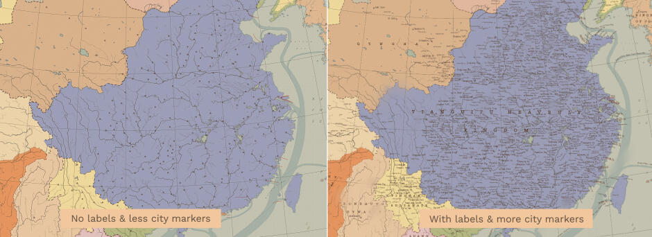
(Left side has fewer labels than the right side)
Anyway, a good way to make a map look like it's big and something you'd actually see in real life is to make everything thinner and smaller. E.G smaller font sizes with larger distances in-between them, a lot of whitespace between country labels and country boundaries, thin strokes etc. etc. (more on whitespace later). This is because they wouldn't need to be big on large maps.
What I find is often the primary way to give a map more detail is to have more labels in it. The best way to do this is to add more cities, which in combination with the smaller text & the like really gives the map a lot more detail. So I recommend that you add more cities, natural feature labels, sea labels, labels of all kinds (you get the idea).
Getting the colours right
One of, if not the most important part of a map is the colour. It's really hard to define what makes a map have good colours. But in general, warmer colours are important. (they don't have it be, but they - in my experience - often are).
You'd be surprised how much you can change the hue of things like green & red and still have them be recognizable as green & red. For example: oftentimes, greens are closer to yellow in hue and reds are closer to orange in hue. (Granted, the saturation & brightness changes).
Another important thing is to avoid using solid blacks, as they give a stark contrast, which you often want to avoid in maps. You can also use different shades & hues of black to distinguish between different things (for example, the cities & the rivers (if the rivers are black/dark). The same goes for whites, you often want to avoid solid whites.
In general, don't use heavily saturated colours - unless you know what you're doing. If you have too many saturated colours they compete for your attention and it can look like a crayon drawing if you didn't use them well. You often want to desaturate whatever isn't the main focus (most prevalently, the sea) and have the focus be a little more saturated so the viewers eyes are drawn to it.
What I recommend is to look at maps you really like and see what they do well with colour, whether it be the well developed use of a lot of colours or the use of only a few.
Making a good frame
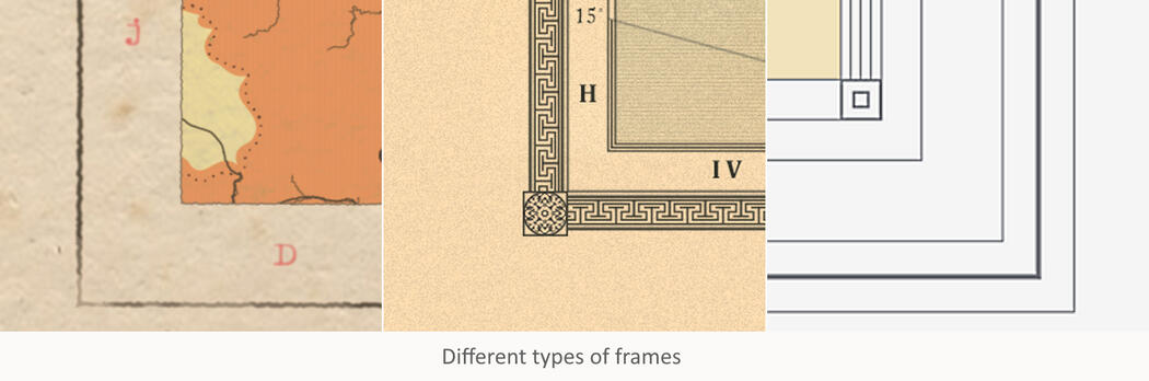
When it comes to the frame, it's really up to you how complicated you want it to be (if you want it at all). But it really ties into the other things I've written about like thin lines, not using solid whites etc. tie into the frame.
How ornamental you want the frame to be really depends on what style you're going for. A simple 20th century atlas will most likely not have a detailed frame, maybe a pair of lines with varying thickness. While an ornamental 19th century frame would have many more and maybe even more detailed aspects.
You also want to think about symmetry when making it. What I find often works is to have squares (not rectangles) of varying sizes (for different spacings) but don't eyeball them, instead do things like halving the size and use those squares. Then base the line going around the map from those.
Frames are also a good way to label extra information like the labels for graticules. However, you want to be careful about having text in the frame - if at all.
Having text in the frame very conveniently ties into my next point.
Whitespace
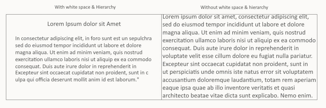
Whitespace is one of the most important parts, it's up there with colour & fonts.
Whitespace essentially means having negative space without anything in it to let the design 'breathe'. This is important so that the map doesn't look crowded, which also ties into the "don't use too large fonts/stroke widths," which I hope I've hammered into your head at this point. When writing any labels at all, you want to consider this: Give labels space and let the design breathe, this goes for large blocks of text but also labels in general. Which means do not fit country labels to the edge of a country.
This is most of what I've learnt from making maps, and it ties into my other point.
Studying maps to improve
I know this sounds boring, but it's important to note that I don't necessarily mean this as in taking notes (while that is all well and good), I mean it as in taking a mental note as to what a map does right.
For me, the best way to improve is to study maps. I know it sounds boring, but it essentially boils down to, instead of looking at an excellent map and thinking "huh, that's neat," and then going on to make a map and think "damn, this sucks," x1,000 instead look at what that map does well, and I mean - it's totally fine IMHO to take things from maps you like, as long as you don't copy them outright and blend different elements you like into one map. All the points I've made I've learnt by doing this. Eventually, when you've being doing this for some time, you'll see you've improved - a lot.
Curving text
A neat thing that many programs allow you to do is to curve text (and I don't mean like following a circle, but a path).
Only rarely do old maps have straight text that runs parallel to the bottom of the map/the frame (as in labels for countries & the like, not informational text). What they often did is that they had things like the country labels follow the graticules of the map. So, when you’re in one of these programs that allow you to do this (I know Illustrator, Photoshop and, I think, Inkscape can) please do it. It not only allows you to better fit in the labels without giving of that stereotypic “Paint.net” type of look.
For me, if I’m going to make a detailed map (which I try to make all of my maps), I want to have as many labels as possible (within the bounds of being necessary) while still having it be legible and look good.
Other tutorials
Tutorial done by Charles / Liberec / Kuhx / all the other aliases